Look, feel and working – the three primary features of good design, as stated by the legendary Steve Jobs.
This holds true for websites too. Today, it is not enough to have an aesthetically pleasing website – the functionality should be justified as well.
Below, let’s look at some of the common website design mistakes that people usually make. And as advised by the master, we will consider all aspects of the websites’ look, feel and function.
Let’s begin
11 Website Design Mistakes to avoid:
Content – Choosing the right combination of textual and visual content
What does content mean to you? For most, content means only textual content, i.e. words and sentences. But this is only partially true. Today, content means more than just words – it includes multi-media and visual images as well. In terms of website design and development, content can be anything used to communicate the message including images, videos, GIFs and words. So, even if one is missing, it translates to design failure.
Content also accounts for original and robust content. If your website talks about the things hundreds of others are, then there is nothing to distinguish yours from those. Your website should be unique in its manner of conveying the message and targeted at the right audience.
SEO – Because your audience needs to find you on the internet
Did you know – there are over 5.5 billion Google searches made every day? (Report published by Hosting Facts). And even if there are only 100 searches related to your business being made daily, fact remains that your website will have to show up in search results in order to gain traffic and increase inbound leads. And that will not be possible unless you have an SEO friendly website.
SEO or search engine optimization is a technique through which websites are found on Google and other search engines. Unfortunately, even to date, most websites fail at SEO, making even a great product lay buried somewhere down, invisible to prospects. Investing in the right SEO services for website optimization is, therefore, a smart move for businesses that want to earn their share of the pie.
About Us – People want to know about you before doing business with you
When doing business online it is very important to build trust with the audience. The ‘About Us’ section plays an important role in doing so
The ‘About Us’ page introduces the brand to the audience. It talks about the company’s history, mission and vision, the culture, management, people, goals etc. In many cases this helps in identifying with the audience and is not surprisingly that it is one of the most visited pages in any website. So, if you haven’t paid much attention to the ‘About Us’ page in the past, it is time to do so.
Testimonials – Because credibility matters
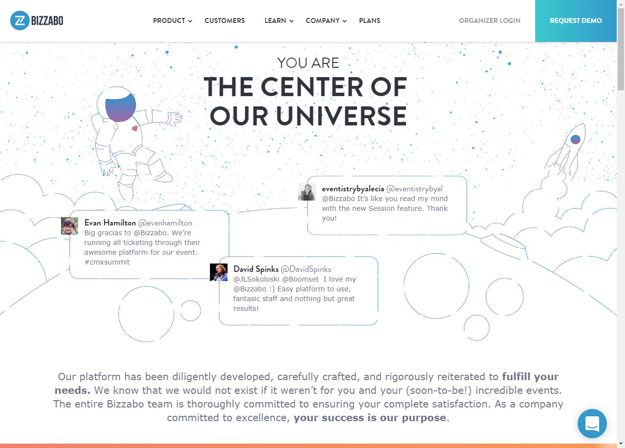
Testimonials are the easiest way to build credibility among prospective customers. People feel more drawn towards brands that have real people talking about them. Word-of-mouth will never go stale and is still a smart way of promoting your brand.

Today, brands are trying innovative forms of testimonials/reviews, to keep it real. Google reviews, Facebook reviews, LinkedIn recommendations and direct website reviews are still some of the common ways of having customers talk about your brand.
Video testimonials through YouTube and tools like Boast take authenticity to the next level.
Even a great website can miss out on conversions if they are unable to build trust. So have the testimonials prominently displayed
Contact Information – Tell them how to reach out to you
It would never be enough to emphasize on the importance of having your contact information clearly visible to visitors. Since the homepage is the page that drives maximize traffic, it is necessary to have some form of contact details on the homepage while a more elaborate one can be displayed on a separate ‘Contact Us’ page.
In most cases, your visitors are curious about your products and services and would want to contact further. Having the contact details such as phone number, email addresses, physical/mailing address etc. is a way of ensuring that they are able to reach out at ease and convenience. Key is to keep the contact details consistent across the website as well as partner sites.
Email Signups – Not to miss out on any opportunity
The obvious thing to assume would be to use email addresses for email marketing by obtaining opt-in email contacts, but subscriptions are a smart way of staying in touch with prospects.
Social Media Integration – Social proof is the new form of collective feedback
The modern internet user is smart. They know that even the best product descriptions can be fake unless backed by authentic reviews. And there’s no better way to get validation than social proof.
A decade ago, one would trust a brand recommended by a trusted person – and the trend hasn’t changed much. In fact, it has expanded
Before making a purchase or even associating with a brand people turn to sites like Facebook and Yelp, to know what collective opinion is the brand.
Integrating all relevant social handles into your website design today is essential for building credibility. When visitors visit your website, they would most likely visit the social sites to discover what people are saying and also find a way to identify with the brand. Keep your social profiles active and interesting as that could gain you new customers is therefore indispensable. Try to find a relevant social media marketing agency to manage social profiles in case you don’t have the competence to do so.
Blog – Have a voice of your own
Blogs are one of the finest ways to generate authentic leads, create brand awareness and engage with prospects. A website without an active blog link is a shortcut to missing on opportunities.
You may be an expert in your field, but unless you showcase your expertise to the word, you won’t really be regarded as a leader. Blogs are the platform that will help you to share news, articles, methods, tips etc. and other relevant details related to your area of expertise.
The audience today is savvy and likely to do research than blindly make a purchase. A blog could be the means of earning their trust.
Conversion Opportunities – Sometimes people need to be prompted to take action
 The look and feel of a website is integral when it comes to audience engagement and retention. But all of this has little value if business need is not justified – i.e. conversions. Websites should be designed in a manner that visitors take desired action. Whether it is to download an eBook, fill in a form page, or even subscribe to a newsletter, it is imperative to prompt visitors to take action.
Websites as such must have clear and distinct CTA or Calls to Action and Contact Forms.
A good website is one where visitors can effortlessly find the information they are looking for – and can act upon it. Contact form, for instance, is one such means for gathering visitor information so as to follow up on them. After all, you have been smart enough to drive traffic to your website and engage with them – so don’t make them leave without taking some action.
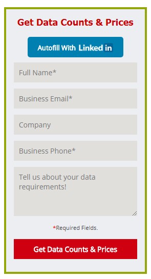
This particular form from Span Global Services is an interesting example. It collects the lead’s contact information, giving the option to auto-fill from LinkedIn, while the CTA clearly makes a business commitment.
Responsive Websites – Is your website compatible with all devices?
This is the era of smartphones and tablets – and with millions of smartphones users, it is not enough to have a website with a desktop version only. A responsive website that adapts to the device it is being displayed on, is the only way out.
Building a website compatible with various devices is no mean task and may require professional website design and development services. From fixing images to font size, headers and navigation, a mobile-friendly website is what all contemporary businesses are aiming for and can be a key distinguisher in the race for supremacy.
Also, with Google and other search engines updating their search criteria, website non-responsiveness would be a critical factor for low SERP results.
Individuality – What’s unique about you?
Every brand has something unique about themselves and the website should be able to speak of it – distinctively. For instance, if you have worked on your social media marketing strategy and have a lot of traffic through social sites, then this is something that your website should give emphasis to.
The bottom line is – there’s a lot that can be done to build an outstanding website. But what is important is to find the balance between what looks good, feels great and works effortlessly.
Reach us at MetricFox and allow us to help with the right website design solutions.


